Thursday, 19 November 2015

About Setting up Boundaries


In any given class I am pretty open about what ends up on my young artist's final pieces because, Art. I love their creativity and I normally don't want to put up boundaries or barriers to their creativity because and I'll say it again: Art.

There are times, lessons, techniques, and projects that require boundaries, limitations and rules to be followed. This multi-week lesson is one of those times. While I am completely psyched to see my young students take a technique and subject matter to a completely different place than I could have imagined; I also think that constraining the boundless creativity once in a while is a wonderful way to flex the creative muscle in a different way.
A reduction print using black, white and two other colours was going to be a tricky lesson regardless of the age and skill level of the students in my class. To make things simpler I reigned in the subject on top of the limits to colour application. Instead of a pictorial image I had my students use geometric shapes to create a pattern inside their image frame. They could place them side by side, overlap them or create an image with their shape. I then had them choose two colours to add to their composition leaving some areas white, filling in some areas with black and using the other two colours at their discretion.

All of this was shared at the beginning of the first of the classes  and revisited through out that lesson with explanations of why I had given them these limitations. Of course with out a finished project to demo for them there was a lot of confusion but for the most part they stayed within the restrictions I'd set out. I am a tiny bit humbled at that, these young people are putting faith in me to lead them through this mysterious project. The pressure is on.


 I have a few students who are know for owning boundless creativity and their work is highly detailed; often following their own inspiration as opposed to the subject demoed in a lesson. They use the techniques I set out in the lesson but create a work of art surpassing the lesson. Conveying to these free spirits the importance of working only within the boundaries I'd set up in this lesson was a battle fought on a slight incline that became steeper with each step.

I am currently wrapping my brain around ways to get these ideas across to these two young artists. When fine detail will hinder a project, when an abundance of colour can't be fit within the time frame of the term and will likely become too frustrating; and even worse, boring. As it is I'm already considering reigning in the lesson even more and taking out one of the colours in the design...

This lesson is one where not only am I teaching a technique but I am also learning about how best to teach it. I'm really looking forward to see how they all turn out and on top of that I"m looking forward to the lesson after this one is completed: a straight up painting project.


Tuesday, 17 November 2015

Party Time

Every once in a while I'm asked to teach for a birthday party at Artspace. These can be huge affairs with ten plus children* excited to be together and rowdy and boisterous full of creative energy. They can also be a calm and gentle oasis (right up until the cake is consumed) full of creative energy. Did you see what I did there? Regardless of how many kids are at an art party that creative energy is there and it's brilliant to be a part of.
*or sometimes even less than ten kids; it's rare but it happens and this weekend was one of those small affairs


Artspace offers a few different options for visual art parties, Clay Creations, Painting and Drawing and Mixed Media Creations. Within those options we as instructors get to tailor create a lesson suited to the birthday honouree. Sometimes it's a specific theme; How to Train Your Dragon, Princesses, ponies... Other times the theme is wonderfully open and non specific; like the birthday I taught last weekend. When I met the VIP on a quick walk through and tour of Artspace a few days after booking her party I had the pleasure of being able to ask her myself what theme she wanted her party to be created around. Without hesitation I was told, "flowers" with a small caveat; there would be boys at the party so maybe they could create blue flowers for boys?'


I never shy away from knocking down gender specific bricks when the opportunity rears it's head. I was quick to exclaim that flowers are not just a girl thing or a boy thing and that I could come up with a project that would suit everyone. And with a little collaboration with the artist/administrator at Artspace I think we did.


 Whenever possible we like to use recycled materials for party projects, these made use of take out food containers (pizza boxes used for transporting sandwiches for my eldest child's hot lunch program) and egg cartons.

Every piece made by the party participants made use of the same materials. All of them look completely different and amazing.


Monday, 16 November 2015

My House Smells Like a Candy Cane : Reduction Printing

Last week I posted about a multi-week printmaking lesson I was starting.

I knew it was going to be challenging but I suppose I didn't quite get the level of challenge this class had the capability of reaching. I am not quite sure that that last sentence actually means what I think it means but I'm going to leave it as is...

I'm teaching myself how to teach this lesson. There are technical challenges for this project that I've been figuring out and problem solving throughout the planning and the execution of the lessons and the challenge of transferring my student's images from paper onto the Styrofoam plates they will be using to print off of is one of the most technical. I've had my brain working overtime to figure out the best process for transferring the images while keeping the integrity of the plates intact. Any indents made to the surface would become white areas on the print and I didn't want my students health to be a factor; on top of that there's the factor of time to consider. This project will take at least three classes to complete.

I want my students to begin the process of creating an image as soon as possible otherwise they'll lose interest. Keeping those things in mind I tested a few image transferring techniques and settled on using peppermint oil to transfer the coloured pencil drawings onto the Styrofoam plates. An extra plus is that with further testing I now know that peppermint oil will transfer oil pastel drawings which offers a solution to the more detail loving student challenges this lesson brings to the table. The nature of this project is not friendly to teeny weeny details big shapes and bold lines work best. providing the intricate artists in the class with oil pastel forces the issue... which means there are more challenges involved....

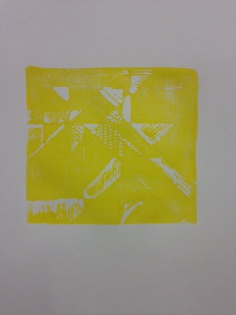
First colour printing of my demo plate. Next step is to
carve out the ares that will stay yellow and print
the second colour on the plate. 
My living room is minty fresh and the evaporation from rubbing the drawings gently onto the plates has made my hands cold. With that solution in place I'm now considering the other challenges this lesson is providing.


Sunday, 8 November 2015

Mono Print Finished Art


While mono printing with this technique is an excellent invitation for parents to collaborate and create art together (without highjacking the work all together) only one of the images here is a true collaborative effort.* The rest of the singles I'm featuring were 100% the work of my young students. For the most part at the Toddler and Preschool age, images will be abstract shapes that kind of look like what the students will tell you they are drawing. Sometimes there are young artists that are very good at drawing what they see. In either case they are amazing.


For this lesson we drew on our printing paper with water resistant crayon or oil pastel, Students could trace the general outline of shapes onto the acetate sheets we used as mono printing plates, then flip that image over and then add colour with water soluble marker to the other side of the acetate.  We flipped the outline over so that the colours added to the image when we printed would match up with the drawing, other wise everything would be opposite.


While the colour was being added we soaked our paper in a water bath so that the images in marker would transfer onto our paper. When we were ready to print we used a squeegee to take away any extra moisture from the paper: The image transfers best when the paper is damp and not shiny wet.


*The group shot also has extra examples of collaborative parent child art. The cupcakes, butterflies and cats are parent participant art. The rest, including the animal face with the pink nose featured above; were all done by the children alone. 


Saturday, 7 November 2015

Negative Space Take 2

My Preschool Art's Enrichment class also worked with the idea of negative space and Dots last week.

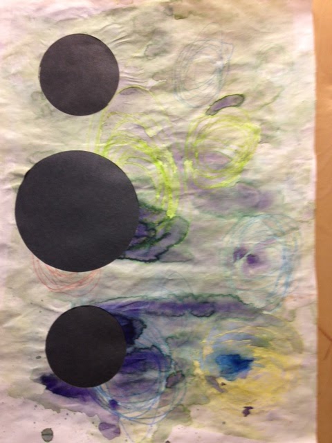
Here are their finished art.


Friday, 6 November 2015

Monoprinting with Younger Artists

I posted a time lapse the other day in anticipation of the start of a multi class lesson plan.

Here's another in anticipation of introducing or re-introducing as the case may be mono-printing to my preschool and toddler classes.


Thursday, 5 November 2015

Circles: Background, Foreground and negative space in a Toddler lesson

Teaching foreground, background and negative space to the under 5 set is a tricky concept.

We used layering and window cuts in this lesson.


We started out with a piece of red construction paper with a taped together pre-cut circle. We drew on the paper with oil pastel and then added yellow paint with sponger and then set it aside to dry. We then brushed water all over our second sheet of white paper and brushed colour and spattered paint using toothbrushes.

Both sheets were left to dry and then I assembled the two pages together, Placing the cut out circle of red paper on top of the white painted paper and a sheet of purple construction paper onto the back of the red paper with the window cut. The display of finished art is giving the entry to Artspace a lovely warm glow that the overcast shorter days is really needing.

I did a variation of this project with my preschool Arts Enrichment Class. I will post about that once I've gotten them all put together.